Styling Guides
How to choose a stitch colour that works with your interior
Velox Stitched Workshop ·

Contrast stitching is a commitment, not a detail. A practical method for choosing a thread colour that lifts the cabin without fighting the car it is going in.
Start with what is already in the car
Before choosing a thread, look at what the interior already repeats. Most cabins have two or three colours doing all the work: a dominant colour, a secondary on inserts or carpets, and an accent the manufacturer used sparingly. Your stitching either joins that system or argues with it.
Walk round the car in daylight and note every existing stitch line. Door cards, gaiter, seat bolsters, dashboard. If the car already has contrast stitching in one colour, matching it is almost always better than adding a second accent, because two different accent colours in one small cabin read as an unfinished job rather than a design decision.
Then check the seat belts. They are the largest single colour block most people forget, and a bright belt can make a thread look like it belongs when it otherwise would not.
Tone-on-tone versus contrast
Tone-on-tone means the thread sits close to the material: black on black, charcoal on graphite, cream on tan. Look closer and you see the line, but the overall impression is texture rather than colour. It is the choice that ages best, photographs well, and cannot clash, because there is nothing to clash with.
Contrast means the thread is deliberately a different colour: red on black, silver on black, cream on brown. This is what makes a stitching photograph look dramatic, and it is also where most disappointed orders come from, because a thread that looks elegant as a swatch can look loud across a whole rim.
A useful rule: the more of the thread you can see, the more contrast you can carry. A single line of stitching along the rim is a detail. A pattern of double seams across a full cover is an area of colour, and areas of colour need to be chosen with the same care as a seat insert.
Use the material as the anchor, not the paint
The commonest mistake is matching the thread to the exterior. A car is seen from outside in body colour and from inside against trim. Thread that matches the paint usually reads as a random stripe in the cabin, because nothing else nearby is that colour.
The exception is a car whose build already repeats the exterior inside: painted trim, a body-coloured panel, belts chosen to match. If that is your car, paint-matching is not a mistake, it is the existing scheme.
Anchoring on the material is more reliable. Black alcantara with black thread is invisible elegance. Black alcantara with red thread is motorsport. Black alcantara with silver thread is factory-performance understated. The same three threads on tan leather produce three completely different results, so decide the material first and the thread second, never the other way round.
The colours that work, and why
- Black on black. The default for a reason. Ages invisibly, sells easily, suits every car.
- Charcoal or graphite on black. A step of contrast, no colour statement. Good on a daily driver that should not look modified.
- Silver or light grey on black. Reads as factory performance trim. Picks up the alloy and switchgear tones already in the cabin.
- Red on black. The loudest safe choice, and only really safe on a car that already has red somewhere: a badge, a seat stitch line, a belt.
- Cream or beige on brown or tan. Heritage territory. Warm rather than sporty, and it suits older cars better than modern ones.
- Blue on black. Underrated and unforgiving. It works on a car with blue calipers or an existing blue accent, and looks arbitrary otherwise.
Two accents at once, such as red thread and blue thread in the same pattern, is a decision that has to be carried by the rest of the build. On a standard car it usually reads as a mistake.
Test in daylight, in the car
Thread is a small, saturated object at the limit of most screens. A phone display will show a green as olive on one and emerald on another, and a leather that looks charcoal on screen can arrive brown. This is the single strongest argument for physical samples, and it is why we post swatches rather than relying on colour swatches on a page.
Take the sample out to the car in the middle of the day, hold it against the wheel and the door card, and look at it through the windscreen as well as from the driver's seat. Sunlight through glass is a different light from the kitchen table, and the car is where the cover will live. The swatch request page covers this, and the materials guide explains how each finish reflects light.
Practical constraints worth knowing
Contrast thread shows every deviation in tension. A perfectly even black-on-black seam forgives small inconsistencies; a cream thread on black highlights them. That is not a reason to avoid contrast, it is a reason to accept that contrast builds are less forgiving to make and should not be rushed, which is part of why our builds are not batched.
Thread also ages. Bright colours fade before neutrals do, and a red that has faded unevenly where hands rest is more noticeable than a neutral that has faded. If the car lives outside, expect the top of the rim to shift first, in thread as in everything else.
Keep the BMW E36 M3 and E46 M3 carbon grip builds in mind as examples: carbon grip is a matte, technical surface, and it carries a strong thread colour better than smooth leather does, because there is less competing sheen.
If you are still unsure
Choose tone-on-tone and stop. It is not a compromise, it is the choice that the majority of buyers who contact us after ordering wish they had made. If you want a second opinion, send a photo of the interior through the quote form and describe the car; we will tell you which threads we would put in it, and which we would avoid.
If you want to see the options on screen first, the wheel configurator lets you change material and thread before committing. Treat it as a shortlist tool, not a colour reference.
Frequently asked
+What is the safest stitch colour?
Black on black, or a shade a step lighter than the material. Tone-on-tone always works because nothing competes. It is the choice to make if the car may be sold, or if you are unsure of the interior's exact shade.
+Should the thread match the exterior paint?
Usually not. A wheel is seen against the interior, not the body, and a paint-matched thread inside a cabin often looks like an accident. The exception is a car with a themed build where the exterior colour is already repeated inside.
+How do I check a colour before ordering?
With a physical sample, in daylight, in the car. Screen colours mislead badly on thread and on leather. Our swatch pack posts free to UK addresses and the materials guide explains what each finish does under light.
Related reading
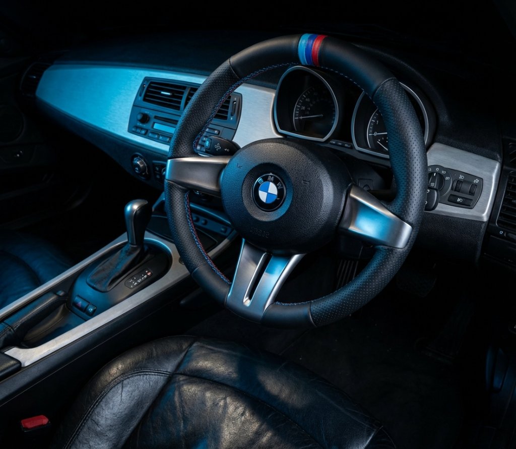
Styling Guides · 27 October 2026
Stitched versus printed: what lasts longer on a car interior
Printing lays an image on a surface. Stitching joins two panels with thread. On the parts of a car you touch every day, that difference decides what survives.
Read the guide →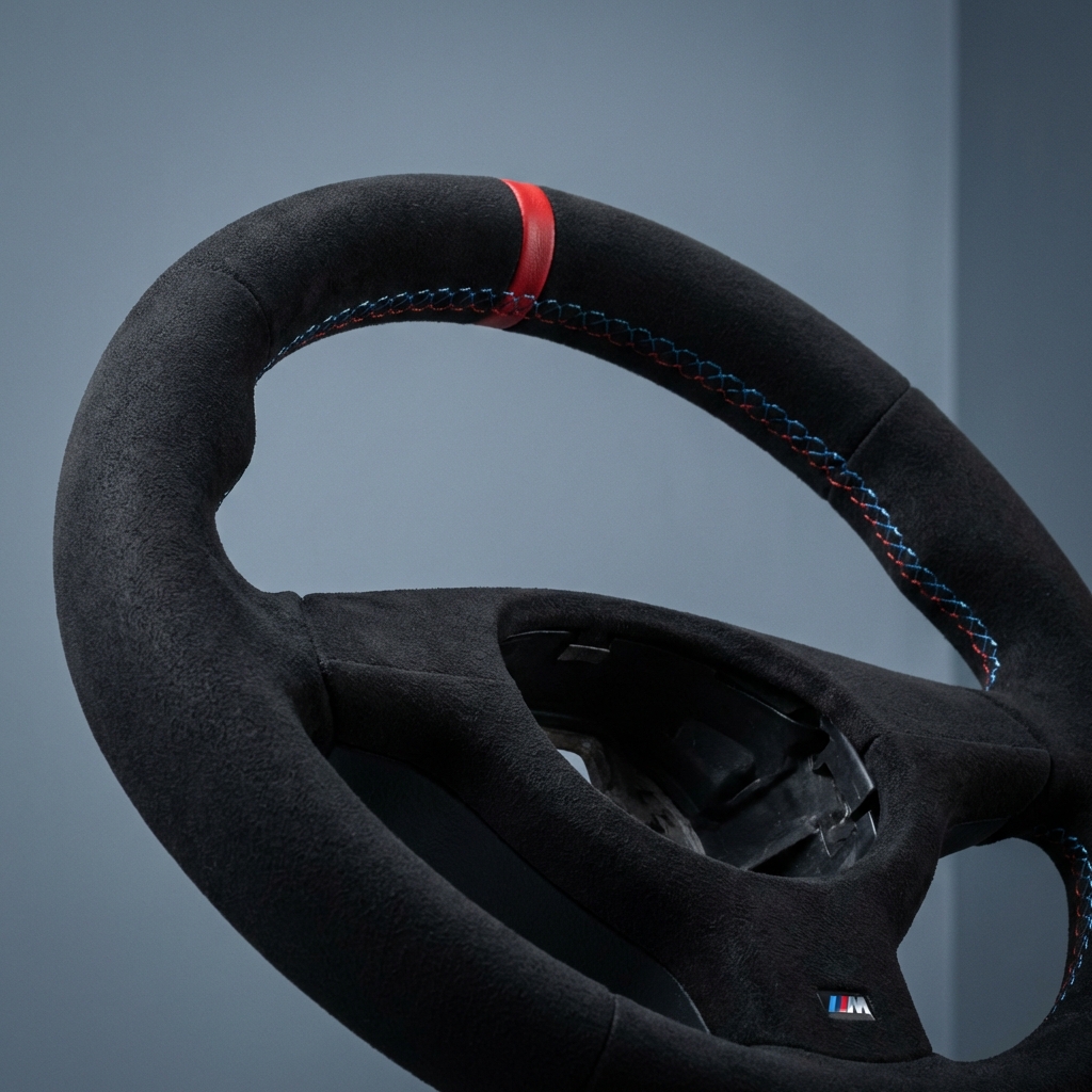
Fitment · 7 November 2026
Popular requests, and how to brief a custom design properly
The briefs that go smoothly have the same six facts in them. Here is what to send, what we will ask next, and the mistakes that turn a simple build into a fortnight of emails.
Read the guide →Gifting · 6 November 2026
Gifts for the car enthusiast who owns everything
When the toolbox is full and the garage is finished, the useful gifts are consumables, samples, and time in a workshop. What we actually offer, with real prices and lead times.
Read the guide →